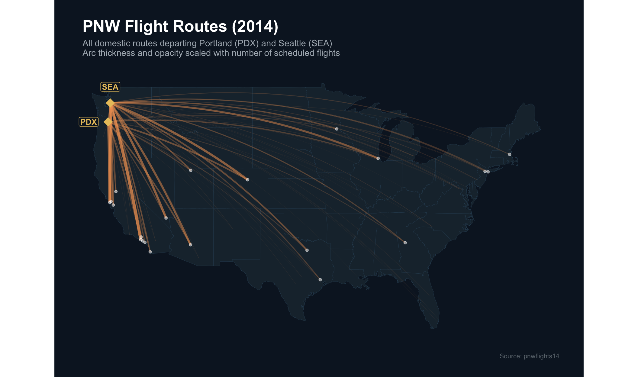
PNW Flight Routes: A Flow Map
Where does the Pacific Northwest fly?
What Kind of Chart Is This?
A flow map (also called a connection map or arc map) is a thematic map that draws lines, often curved arcs, between pairs of geographic locations to represent movement, migration, or communication between them.
| Element | Role |
|---|---|
| Origin node | Where flow begins (here: PDX, SEA) |
| Destination node | Where flow ends (US airports) |
| Arc | The connection; visual weight encodes quantity |
Flow maps date back to around 1838, designed by Irish engineer Henry Drury Harness to depict cargo flow across Ireland. Modern implementations use great-circle routes, the shortest path between two points on a sphere, rather than straight lines, which matters especially for long-haul routes.
The Data
The data come from the pnwflights14 R package, covering Pacific Northwest departures in calendar year 2014.
Three tables are used:
flights: ~162,000 rows, one per scheduled departure. Key columns:origin,dest,carrier,dep_delay,distance.airports: one row per airport with FAA code, name, and decimal lat/lon.airlines: lookup table mapping IATA carrier codes to full airline names.
Quantitative variables: number of flights per route, great-circle arc distance. Qualitative variables: origin airport (PDX vs. SEA), destination airport code, US state geography.
What Is the Chart Showing?
The map answers one question: how is the Pacific Northwest connected to the rest of the country by air?
Key things a viewer can read:
- Dominant routes: thick, bright arcs (PDX/SEA -> LAX, SFO, ORD) are immediately visible.
- Geographic reach: the fan of arcs shows that PNW flyers can reach both coasts directly, though the West Coast dominates in frequency.
- PDX vs. SEA differences: the two origin diamonds allow a reader to trace each airport’s routes semi-independently.
- Hub-and-spoke structure: dense arcs toward a few massive hubs (Chicago, San Francisco, Los Angeles) show how most airlines route passengers through central hubs rather than point-to-point, with notable exceptions like Southwest and Alaska who also serve many secondary airports directly.
Flow maps are intentionally designed for the casual observer. For precise counts, a table or bar chart is superior. Their strength is their accessibility: they communicate the shape of a dataset immediately to non-domain experts, which is where I find them most valuable.